SUMMER POPS REBRAND
LOGOS · BRANDING · PRINT DESIGN · DIGITAL ILLUSTRATION
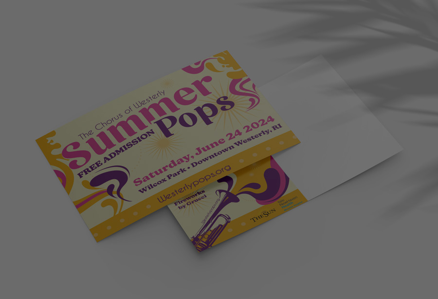
OBJECTIVE
The Summer Pops rebranding project revitalized the event’s identity to capture the lively, energetic spirit of summer and music. The design emphasizes inclusivity and fun, creating a dynamic brand experience.
RESEARCH
- Event Analysis: Studied the purpose and audience of Summer Pops events.
- Mood Board Creation: Collected visual inspiration from summer imagery, music festivals, and community gatherings.
- Insights: Focused on designs that evoke warmth, joy, and inclusivity.
CONCEPT DEVELOPMENT
- Logo Design Exploration: Developed sketches incorporating musical elements, bright colors, and summer motifs.
- Color Palette: Selected vibrant hues like yellows, pinks, and purples to convey summer vibes.
- Typography: Chose bold and playful fonts to emphasize energy and excitement.
FINAL DESIGN


OVERVIEW
Our rebranding of Summer Pops perfectly captured the event’s energy and community spirit. The vibrant, fresh design not only resonated with our audience but also elevated the overall experience, making it more memorable and engaging.