FLIGHT COFFEE CO. REBRAND
LOGOS · BRANDING · PRINT DESIGN · DIGITAL ILLUSTRATION
OBJECTIVE
For this rebranding project, I explored UI/UX design by analyzing Flight Coffee Co.’s customer experience and navigation, both online and in-store in Bedford, NH. Researching their layout, branding, and strategy revealed how they create a seamless and inviting experience. By the end, I gained a clearer understanding of the difference between User Interface and User Experience and their role in brand success.
COMMERCIAL COMPETITOR CONTENT AUDIT
Before selecting a coffee shop to rebrand, I started by comparing the user experiences of Starbucks and Dunkin’ Donuts. These two globally recognized coffee chains may seem similar, but their approaches to customer experience set them apart. To understand this better, I visited two locations of each brand, analyzing what each did well and where they fell short. This hands-on research helped me identify the unique strengths and challenges of both companies.
COMMERCIAL COMPETITOR CONTENT ANALYSIS

Analyzing the target persona and navigation of the Dunkin’ Donuts location revealed a design tailored for a grab-and-go experience. A clear path leads from the entrance to the counter, where staff take orders quickly. Menu screens are easy to see, and there’s minimal seating for short stays. This setup prioritizes speed and convenience over extended visits, aligning perfectly with the needs of on-the-go customers.
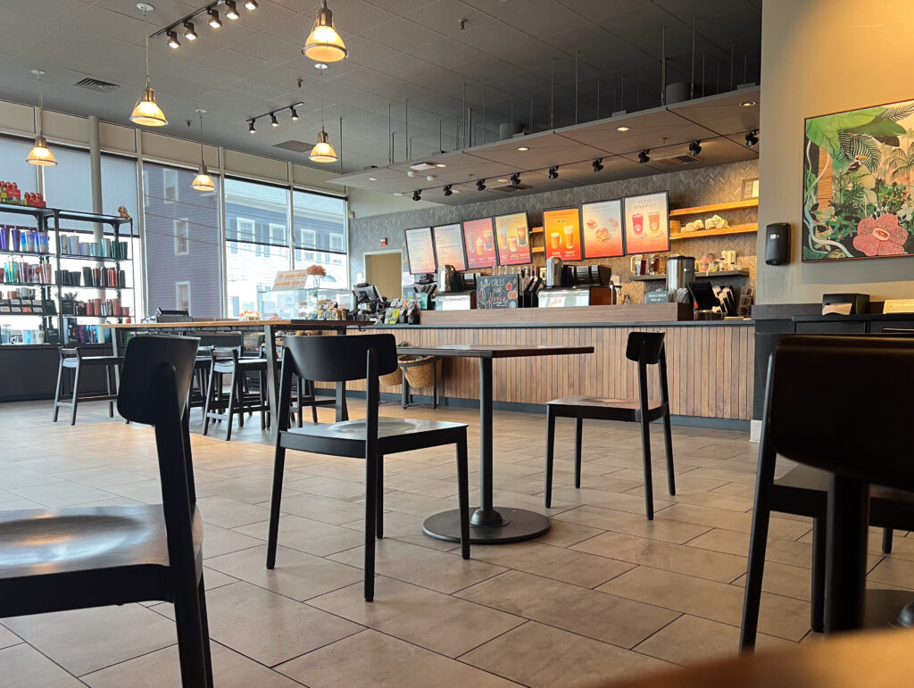
The Starbucks layout is simple and welcoming, catering to both quick stops and longer visits. A clear path leads from the entrance to the counter, where friendly staff take orders, and the menu is easy to see. Seating includes comfy chairs, tables, and quiet corners, offering a space to relax or work. It’s designed to work for both grab-and-go customers and those who want to stay awhile.
TARGET COFFEE SHOP CONTENT AUDIT
Then, I took what I learned about the user experience of Starbucks and Dunkin Donuts’ and applied it to the audit and analysis of my chosen coffee shop.
Flight Coffee Co. caters to professionals, students, and coffee enthusiasts who value high-quality coffee, quick service, and a welcoming environment. The cafe offers ethically sourced coffee with a menu ranging from classic espresso drinks to creative seasonal options, paired with freshly baked pastries and light snacks. The commitment to quality is evident in every detail, from the expertly brewed beverages to the friendly, efficient service.
The atmosphere is a mix of comfort and modern style, with plenty of natural light, warm colors, and simple décor that makes it feel cozy and welcoming. There’s a variety of seating, including shared tables, individual spots, and quiet corners. Whether you’re grabbing a quick coffee or staying to relax, Flight Coffee Co. creates a high-quality experience that feels personal and inviting.
Flight has many affordances some of which are the vast items listed on their menu. They do not want to be known for just selling coffee, they are known as the coffee shop that has it all; this has driven a lot of traffic into the company. Their main intended limitation is fast service and no waiting, yet this is not portrayed into their service. This rebrand intends to improve both pick-up and delivery services.

Flight Coffee Co. attracts young professionals, students, and coffee lovers who appreciate quality coffee and a comfortable, welcoming space to work, socialize, or relax.

After analyzing the target persona, I focused on identifying the whitespace for Flight Coffee Co., which meant understanding where it stands compared to nearby competitors. The chart on the left shows the various coffee shops in the area, each offering different experiences, such as fast service, grab-and-go, or places to linger. Flight Coffee Co. stands out by offering a mix of grab-and-go convenience while also providing a relaxed atmosphere for those who want to enjoy their coffee before heading out.

While creating the value proposition canvas for Flight Coffee Co., I identified key opportunities by organizing the customer’s pains and gains. This process helped highlight what the coffee shop does well and where it can improve to better meet customer needs.

Flight Coffee Co.’s original value proposition, “Coffee for the People,” lacked a clear promise or unique appeal, so I aimed to redefine it to better reflect their strengths and commitment to providing both quality coffee and a welcoming experience.

Products and services currently deployed


This value proposition emphasizes the perfect balance between high-quality coffee and the convenience of a to-go experience. It reflects the shop’s identity as a cozy yet fast-paced destination, designed to accommodate busy lifestyles without compromising the craftsmanship and care that go into every cup.

The main weaknesses and threats could pose challenges for Flight Coffee Co., but recognizing these issues will help the company identify areas for improvement and growth. While the shop offers a variety of food and drink options, fast service, reasonable prices, a drive-thru, and merchandise, there are some areas to address.
For example, the shop’s atmosphere may sometimes be loud, and its delivery and pickup services need improvement. Updating the shop’s aesthetics could also make it more inviting. Opportunities lie in enhancing outdoor seating, capitalizing on the prime location near offices and a firehouse, and prioritizing delivery and pickup services to meet customer demand.
Threats include the possibility of new competitors entering the market, competition from Dunkin’ nearby, and rising costs. By addressing these areas, Flight Coffee Co. can continue to attract a diverse customer base while maintaining its reputation for great service and convenience.
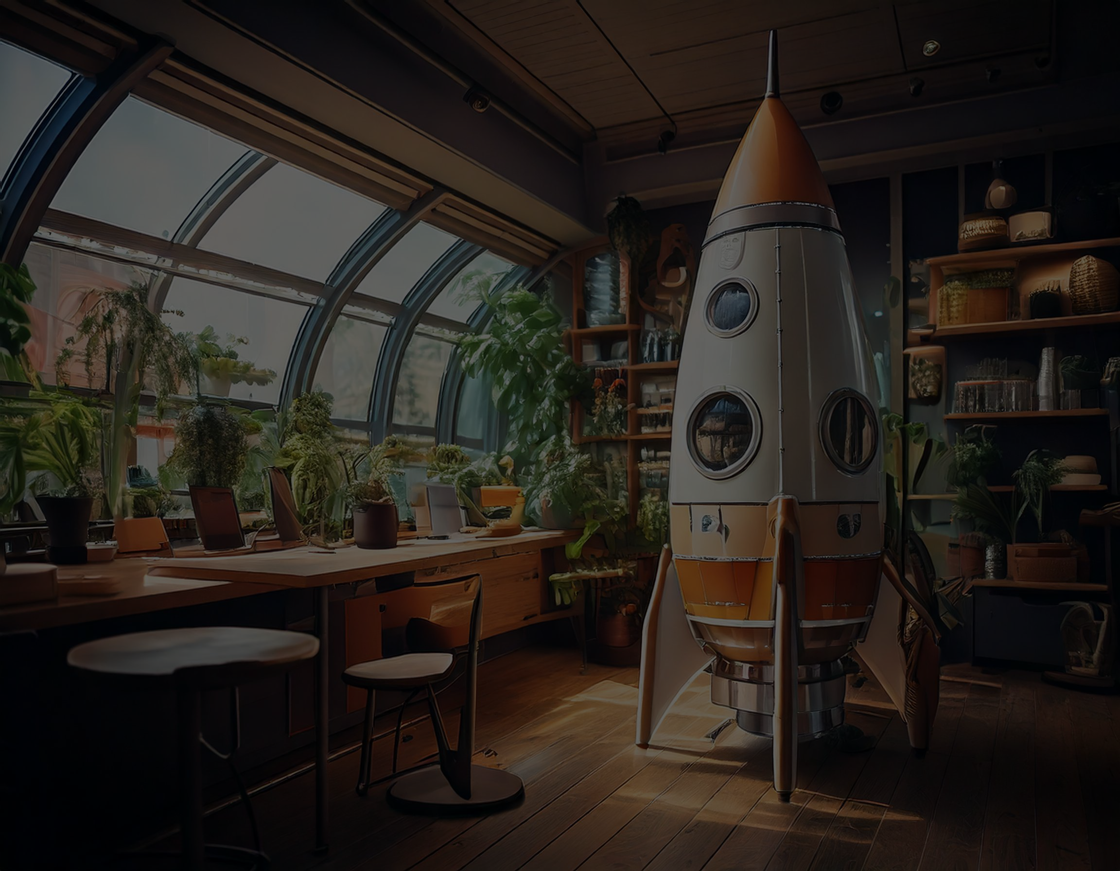
TARGET LOGO EVOLUTIONS


TARGET LOGO MERCH
 Keurig Box Mockup
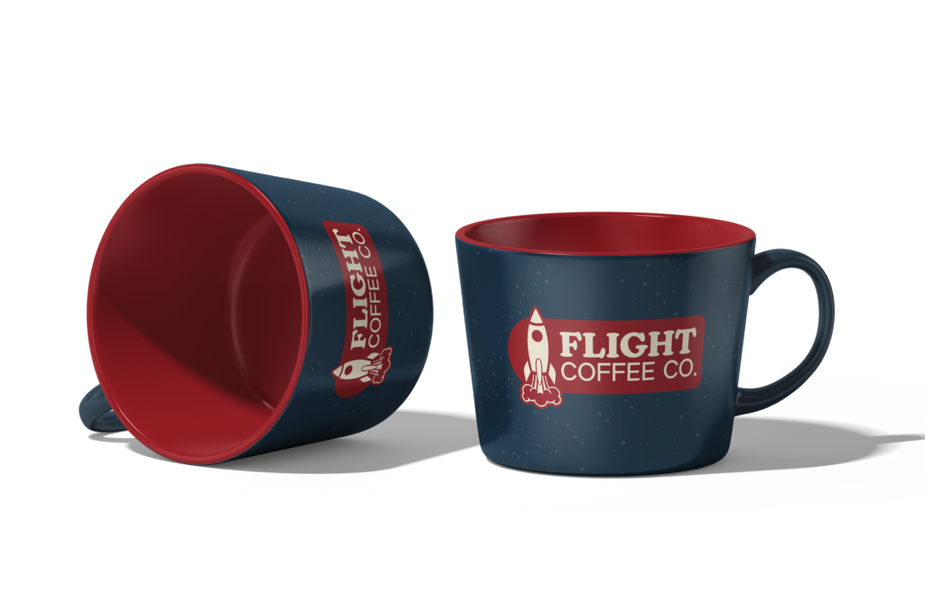 Flight Coffee Mugs
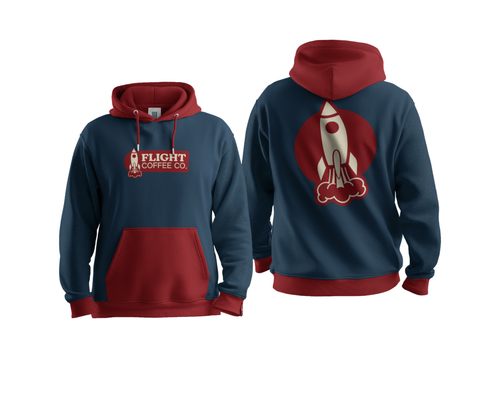 Flight Hoodie
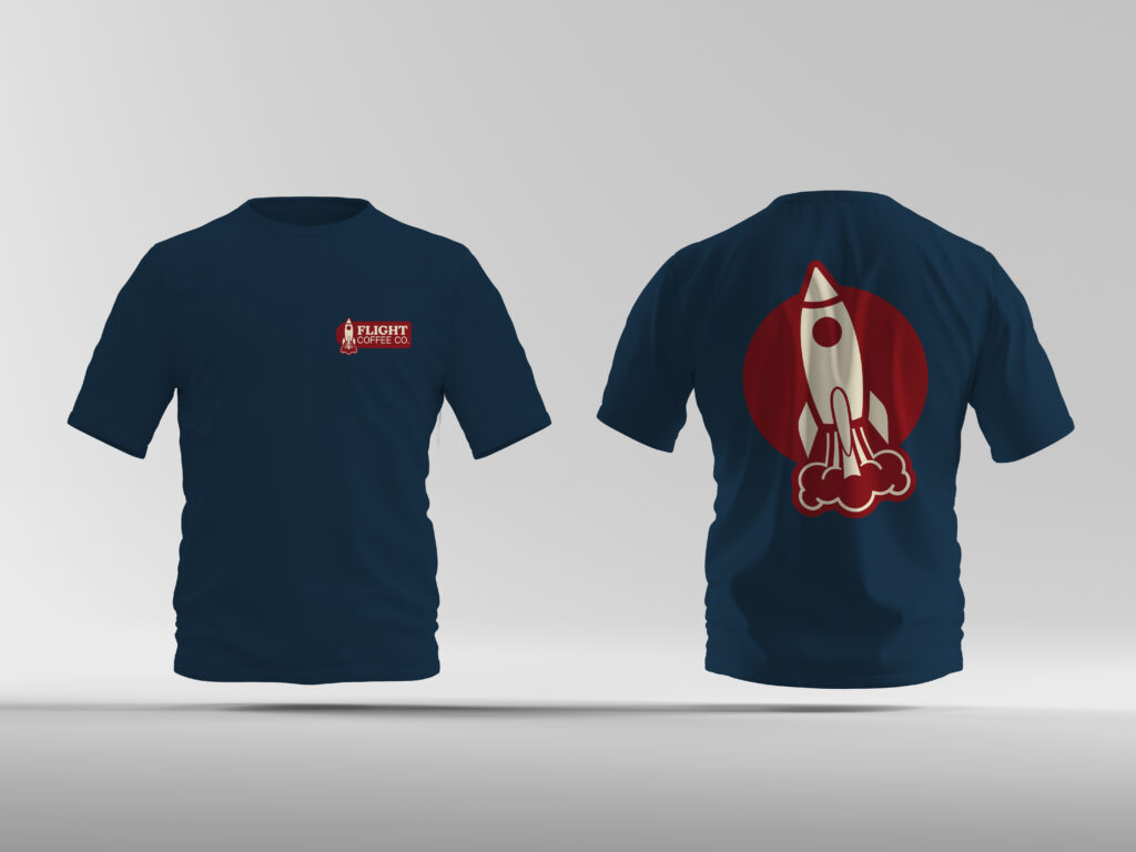 Flight T-Shirts
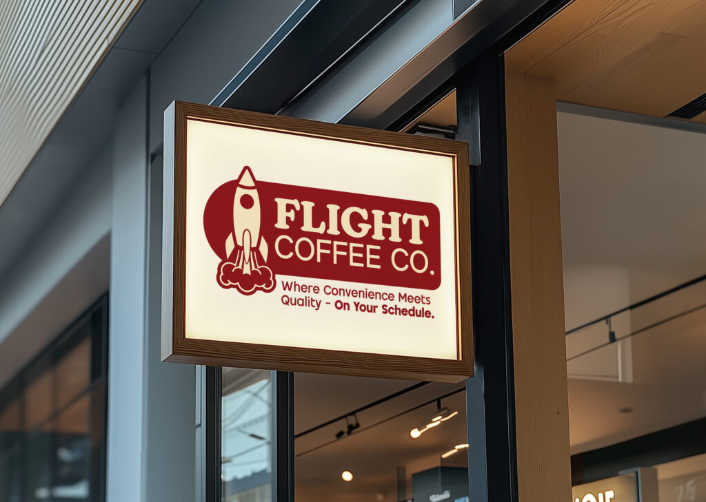 Flight Outdoor Signage
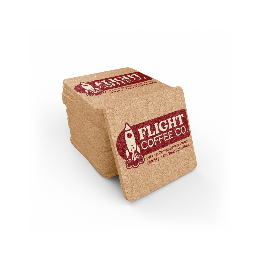 Coasters
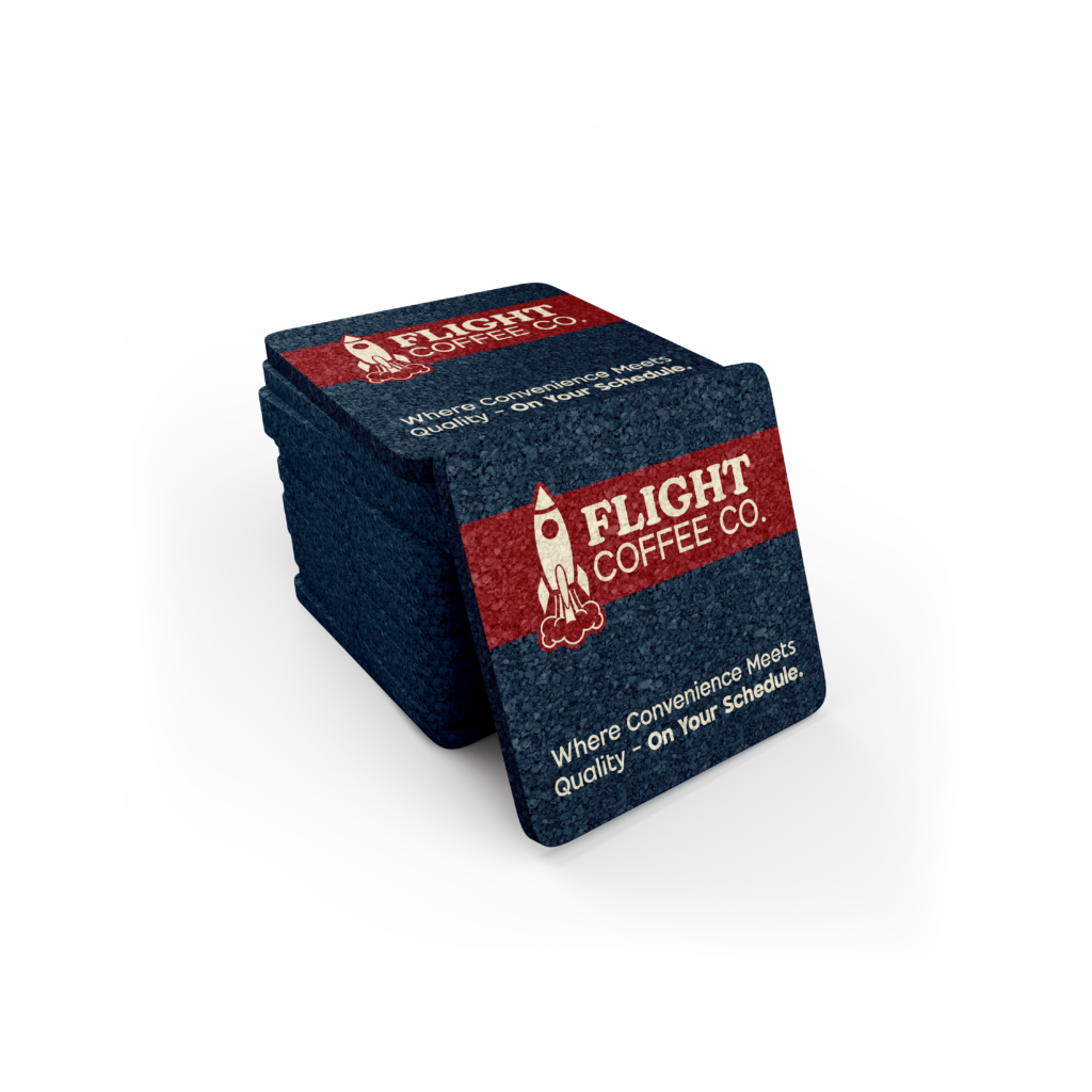 Coasters
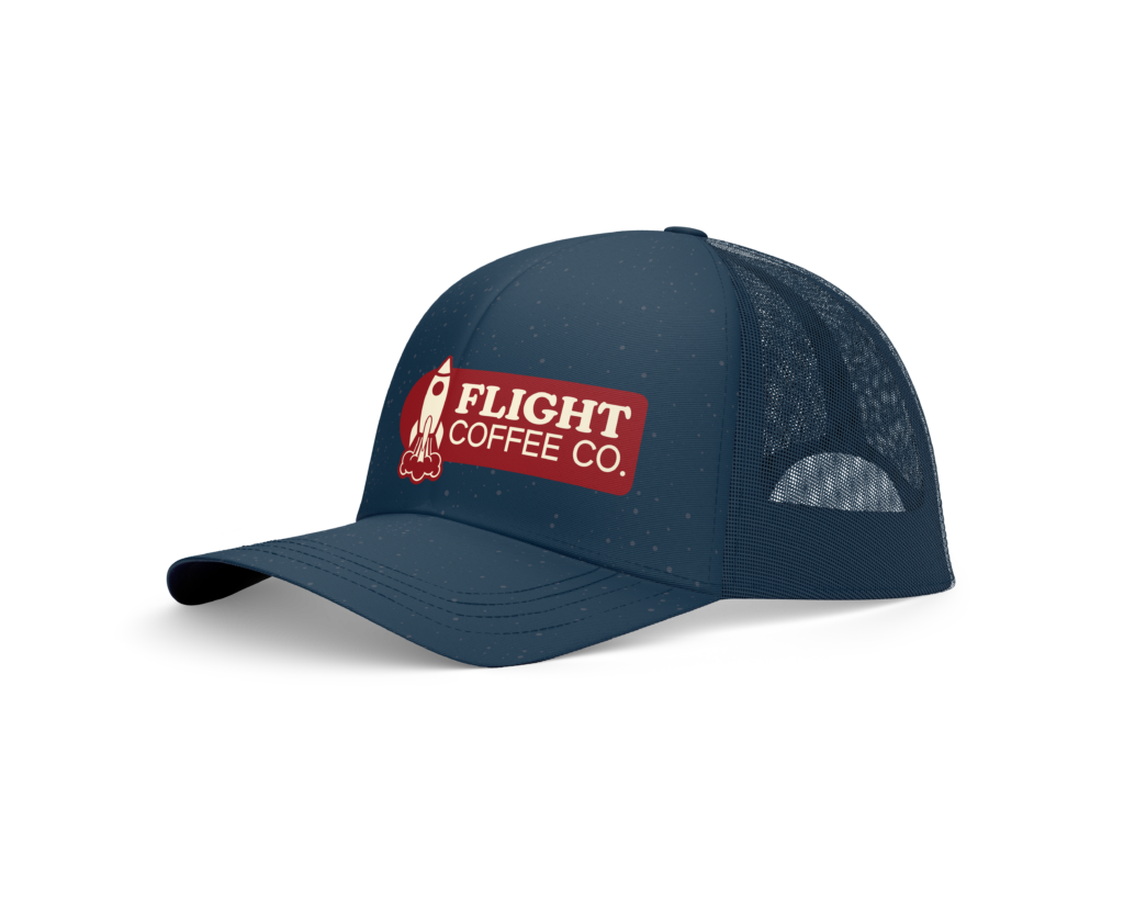 Baseball Cap
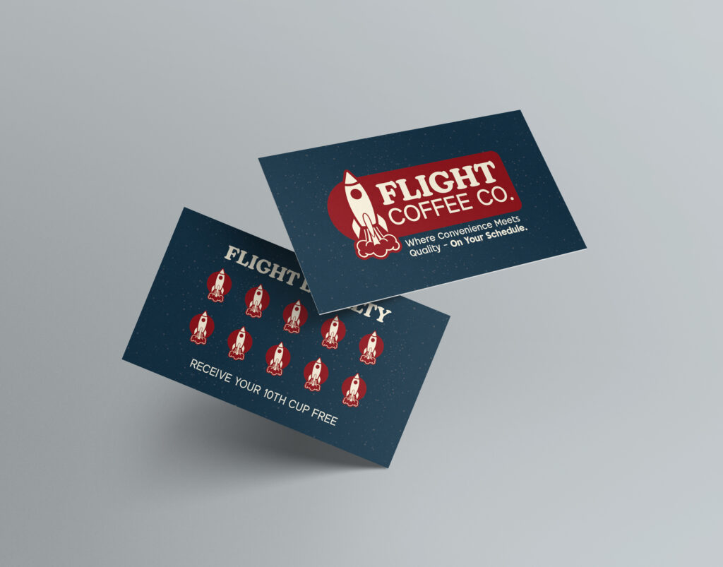 Flight Loyalty Punch Cards
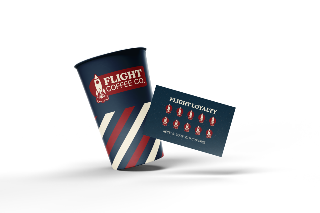 Holiday Special
TARGET MOBILE WEBSITE WIREFRAME


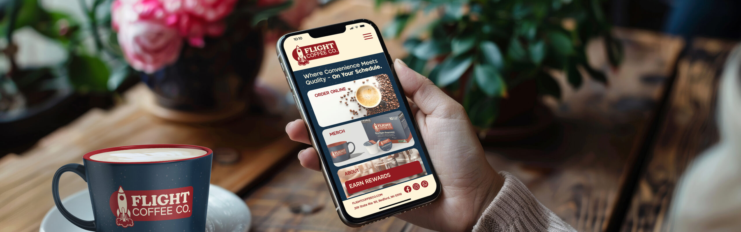
TARGET MOBILE WEBSITE PROTOTYPE


