SUMMER POPS REBRAND
LOGOS · BRANDING · PRINT DESIGN · DIGITAL ILLUSTRATION
OBJECTIVE
The Summer Pops rebranding project revitalized the event’s identity to capture the lively, energetic spirit of summer and music. The design emphasizes inclusivity and fun, creating a dynamic brand experience.

Objective
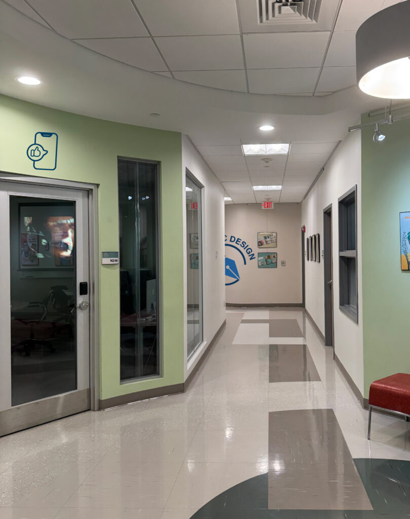
In this assignment, I was tasked with designing a new logo for the GMW department and creating pictograms for the various classes offered within the program. Additionally, I developed a phone app for new students and visitors, along with a digital kiosk to be placed at the school’s entrance. The goal was to create an identity for GMW while ensuring that all elements—from logo and icons to interactive displays—are clear, inviting, and aligned with the department’s focus on graphics, multimedia, and web design. This process allowed me to think about design consistency and user experience across different platforms.
Section 1: About The Client
New England Institute of Technology’s Graphics, Multimedia, and Web Design program (GMW). NEIT is a technical college located in East Greenwich, Rhode Island. The current signage and navigation around campus can be confusing, leaving new students and visitors unsure of where to go. By creating a new logo, pictograms, and updated wayfinding solutions, this project aims to make navigating NEIT easier and more intuitive for everyone on campus.
Section 2: Their Challenge
The client’s main issue is unclear campus navigation, making it hard for newcomers to find their way. Improved signage and guides are needed to enhance orientation and ease.
Section 3: The Solution
I addressed this by designing a clear logo, easy-to-understand pictograms, a mobile app, and a digital kiosk to simplify navigation and improve the visitor experience.


Kiosk Design
After creating the logos and pictograms, I began working on the kiosk design to help visitors find all school departments, with my task specifically focused on guiding them to GMW.


Kiosk Prototype
 Campus Lobby – Welcome
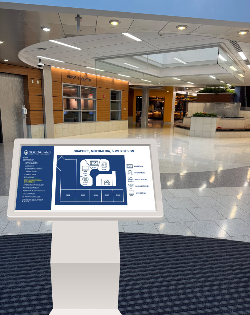 Campus Lobby – Departments
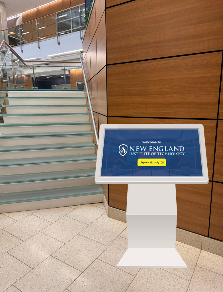 Main Stairs – Welcome
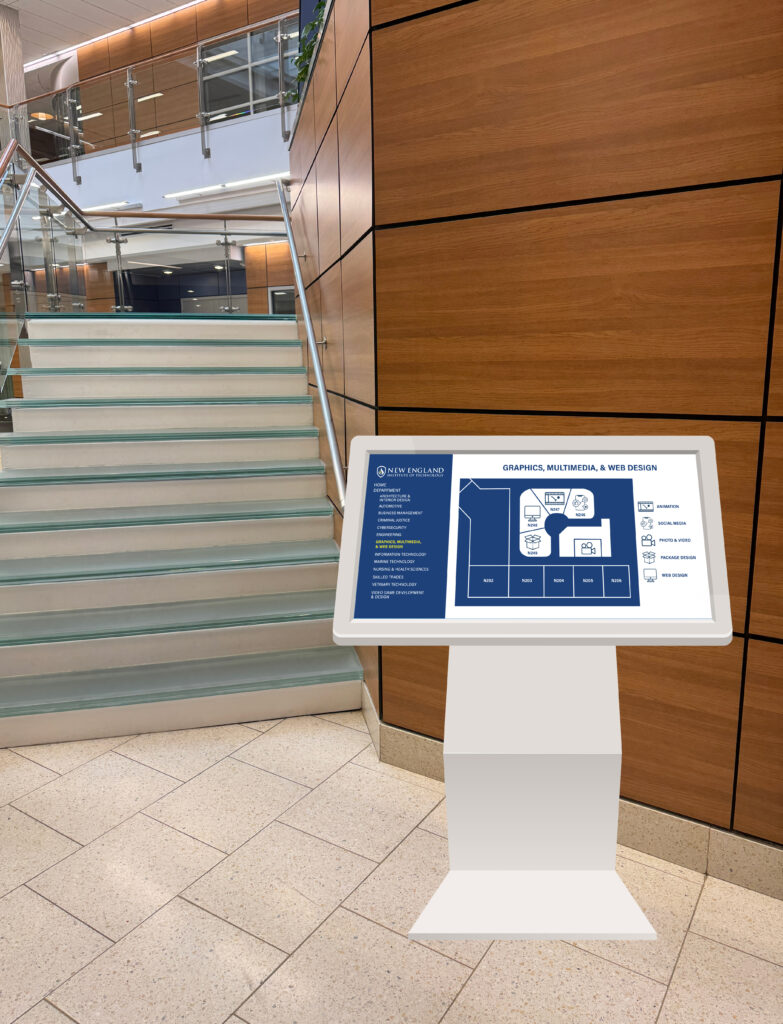 Main Stairs – Departments
Clock Viewpoints of GMW Suite
 12 O’Clock
 3 O’Clock
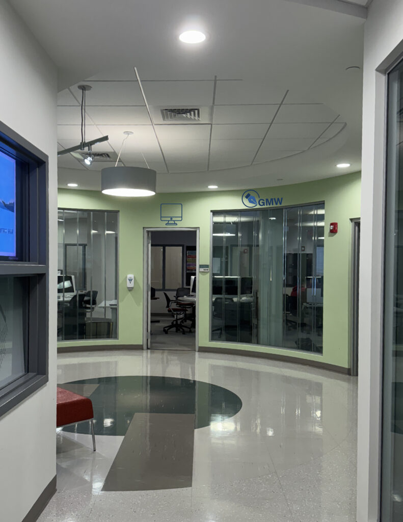 6 O’Clock
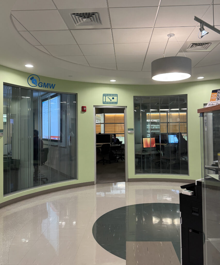 9 O’Clock
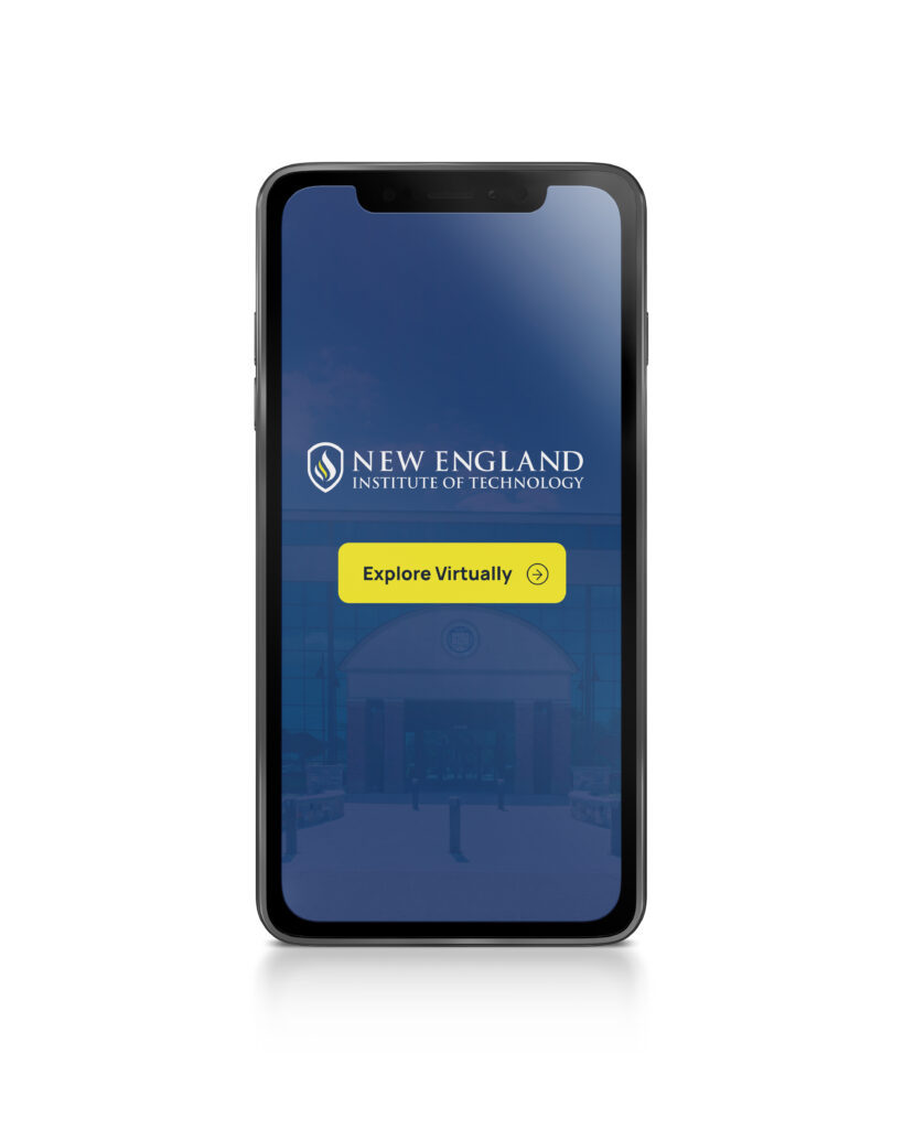
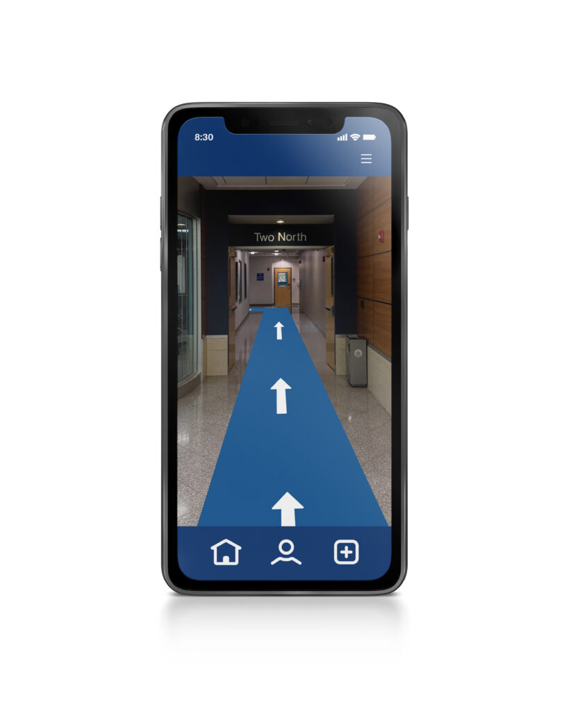
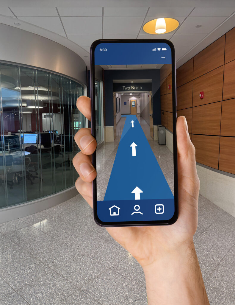
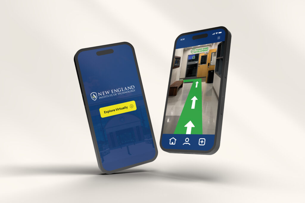
Mobile App Prototypes
These phone app prototypes were developed to assist new students and visitors in navigating the campus. With easy access to department locations and campus resources, the app prioritizes user-friendly design to help users find the GMW department and other areas with ease.
Project Timeline
The planning, design, and development of the logos, pictograms, and phone app prototypes took approximately one week, resulting in a cohesive and user-friendly solution for campus navigation.